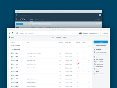
Design Exploration - List View
One of the design explorations I'm working on in search of a global Autodesk product style.
Check out the attachments for the complete screen and side by side.
In this one I tried to maximize the content real estate. The research has shown that for our customers, maximizing the amount of data they can see is a high priority.
Collapsed the table viewing options in the sidebar and split the New button into 2 actions: Upload and Create new folder. This makes it more clear what to expect and reduces the amount of clicks.
Moved the sidebar to the right to put the focus on the content.
Split up the menu visually into the platform level and the context. White is the preferred background color to accommodate the logos which can have a variety of colors across products.
Added a thumbnail to the project switcher to make it easier to glance which projects you are in.
Redesigned the icons.


