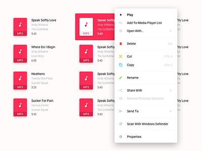
Fixing Windows 10 Context Menu
This is How The Windows 10 Context Menu Should Be!
Please check the attached screenshot to see it's current look. It's too easy to misclick on DELETE when you just want to RENAME the file/folder (Or Vice Versa). I think ICONS can help users scan the menu items more quickly and more precisely.
Please don't mind the Too-Colorful file icons or the repeated file names.
Thank you for stopping by. Don't forget to check the 2x version!
Screenshot Source: Google
P. S: I DON'T FOLLOW MICROSOFT'S DESIGN LANGUAGE FOR WINDOWS REDESIGNS because I don't like its visual aesthetics. Though Windows 10 is the OS I love the most, I hate its iconography. If Microsoft can't catch up with macOS or Material Design anytime soon, probably I'll come up with my own design language (Of course biased!) for Windows! 😂 In the meantime, I am looking forward to Project NEON.


