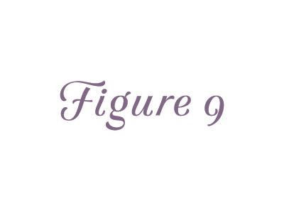
Lowercase for the script caps
I still feel like the slant is all over the place, but these scripty letters are really fun to draw. And so much easier when they don't need to connect! I love a good italic two story g. The 9 might be too ornate for the non-lining numerals, but I know it has a place somewhere.
More by OH no Type Co. View profile
Like
