Financial Self Assessment Questionnaire
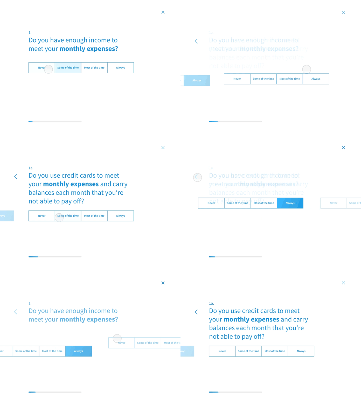
I have recently been working on an interaction prototype for a Financial self Assessment questionnaire. I am working on both the UI and interaction model at the same time in order to produce a solid outcome.
I decided against animating each new question entering the screen as I thought it may be distracting for the user. Simply having each question appear and disappear with an opacity fade makes the questionnaire easy to read and fly through quickly 😎
More by Jacob View profile
Like
