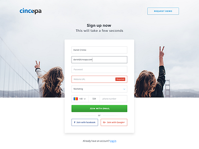
Cincopa Modern Registration
Dribbblers rock!
Cincopa's new modern and clean registration page, we wanted to get user's max attention by removing all menus and footer. also using placeholder instead of labels.
I know this is not really a good UX practice since users needs to see the labels all the time. But what do you guys think?
More by Cincopa View profile
Like

