Pivotus Website
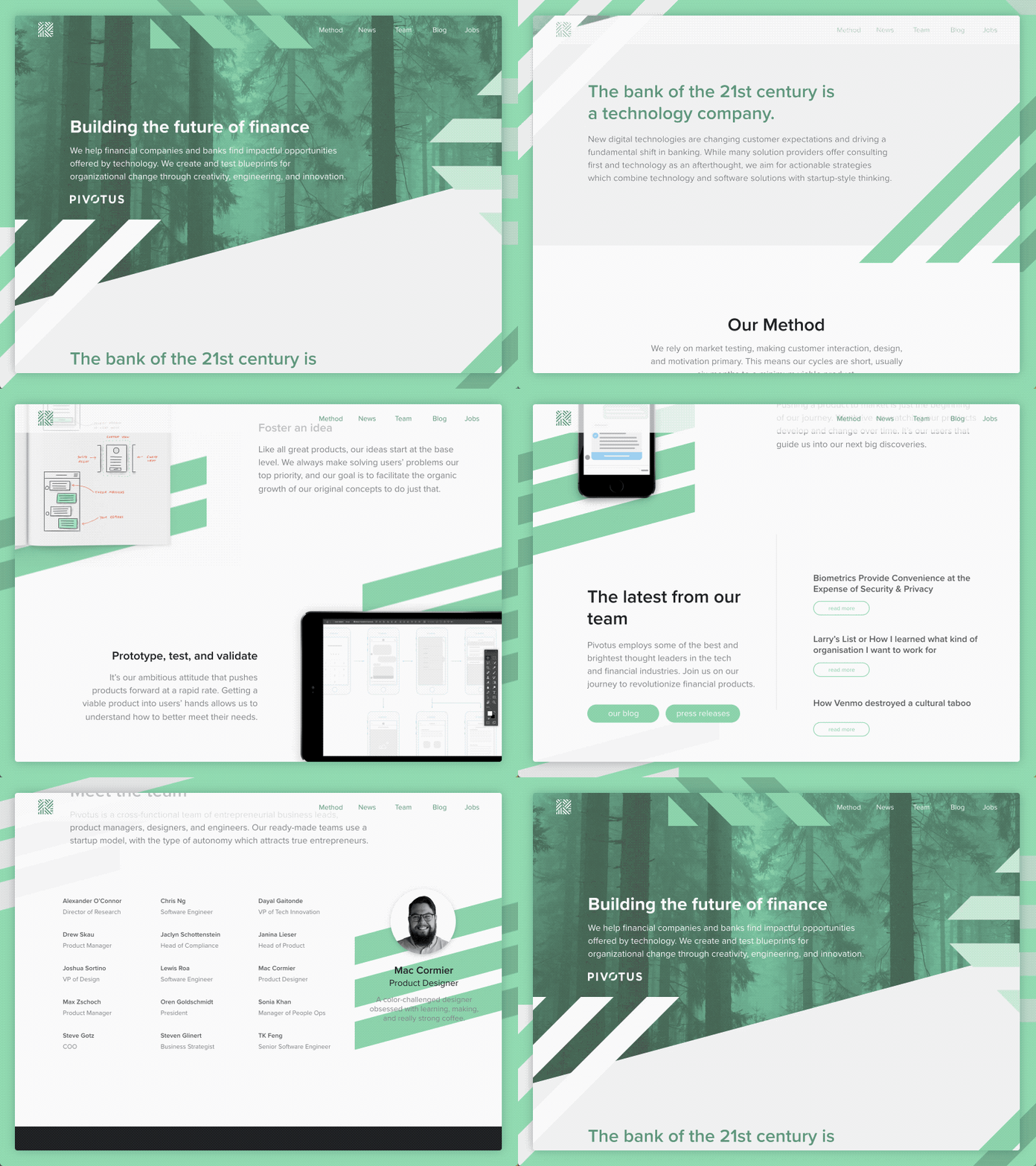
One of the first projects I tackled while working for Pivotus was the redesign of our website. Playing with our exploded logo, we decided to use the segments to add a subtle parallax effect. This was the final mockup we moved forward with.
This animation was made in Principle. Attached is the full static mockup of the site, but you can also check it out live at https://pivotusventures.com.
More by Pivotus Ventures View profile
Like


