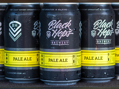
Black Hops Brewery - Pale Ale Cans
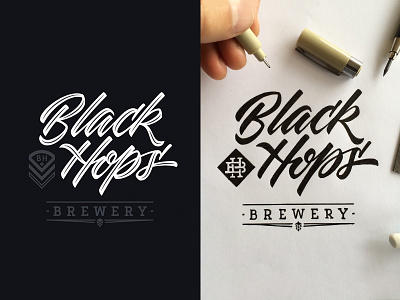
I'm super chuffed about how bloody sexy these cans have turned out. I designed the logo and visual identity for Black Hops Brewery back in 2016 and recently designed their first cans to hit the market.
The yellow part is a sticker that wraps around a generically designed can. This allows them to buy bulk in cans and utilise different stickers for different core range beers. The cans are a matt finish with the stickers being a gloss varnish. But the best part is, the beer tastes even sexier. This has been one of my most favourite clients to work with and also one of the creative outcomes I'm most proud of.
There's a few images attached of more of these tasty bad boys including a 12 pack carton design that stacks vertically. If you're interested in the process the boys at Black Hops did a podcast where we explained the process.


