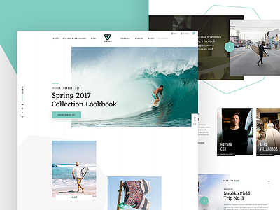
VISSLA Redesign Concept – Homepage
Finally had some free time over the last weeks and decided to challenge myself with a quick design exploration and ran a small side project.
I have been obsessed with VISSLA for the past few months and decided their current web experience should be more in line with their forward-thinking philosophy and outstanding products.
Vissla is a brand that represents creative freedom and a generation of creators and innovators. They embrace the modern do-it-yourself attitude within surf culture, performance surfing, and craftsmanship. This mission inspired me a lot to push their web presence to the next level. So, i focused on the goal to improve the user experience and suggest new solutions or alternative approaches how VISSLA could look like in todays huge digital ocean.
So, this is a small part of an early stage redesign concept – let me know, what you think.
Watch the full case study on Behance:
👉 http://bit.ly/2qD5ouO.
There's more to come in the next days. Stay tuned.
Have a inspiring week.
Thanks,
Simon
—
The Vissla Logo and Brand material is intellectual property of Vissla.
________
👉 Looking for some collaboration? Would love to hear from you – just DM or hit me up on Twitter.
________

