Daily UI #002 - Credit Card Checkout
My Debut! :) Thank you KaL MichaeL for the invite!!
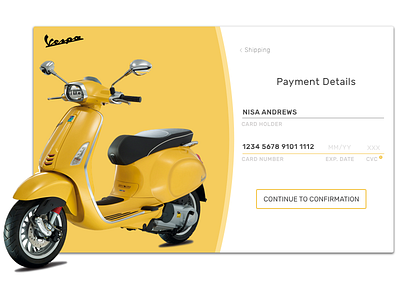
Proud owner of a Vespa like the one pictured here. Vespa's checkout on their current site made me kinda sad, so I took a pass at redesigning it with this fun concept!
See screenshot for current desktop site: https://www.dropbox.com/s/8vtpaazcef2lsgm/Screenshot%202017-04-06%2023.02.57.png?dl=0
Quick thoughts on how I made the Vespa checkout process more lively and enjoyable: The current product photo doesn't add to the value of the product (it takes away from it IMO), and the checkout process takes more screen estate than necessary. Feels out of balance. To address this, I highlighted the product front and center and used complementary colors to make it stand out. I split the screen with the payment process, which includes clear buttons to progress or go back.
Thanks!
<3, Nisa
