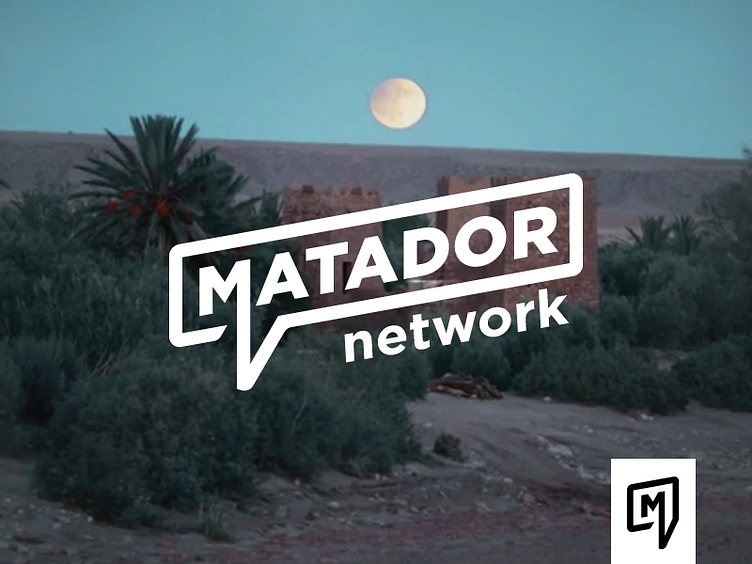
Matador Secondary Logo and Icon
We toyed with making this the main mark for quite a while before deciding on the previous post that was more of an ode to the original logo. In the end we liked this mark so much, we decided to keep it as a secondary mark that could be used to brand the Matador videos they create in house that aren't paid for by sponsors. These videos are a huge part of the value of the website and are one of the things that make them stand out from their competition. They were thinking of giving these videos more of their own section and sub brand, and so we saved this logo for that purpose. It uses the same fonts as the main logo, just angled and in a word bubble. The site was originally made as a social platform for travelers and still serves as a way for travelers to get tips and insider info from the online community: thus the comment word bubble.
