Starbucks App Redesign


I am really fan of Starbucks app but the dashboard screen seems a little bit messy and boring for me. So I have been asked by Starbucks Turkey to design main screen for conceptual purpose.
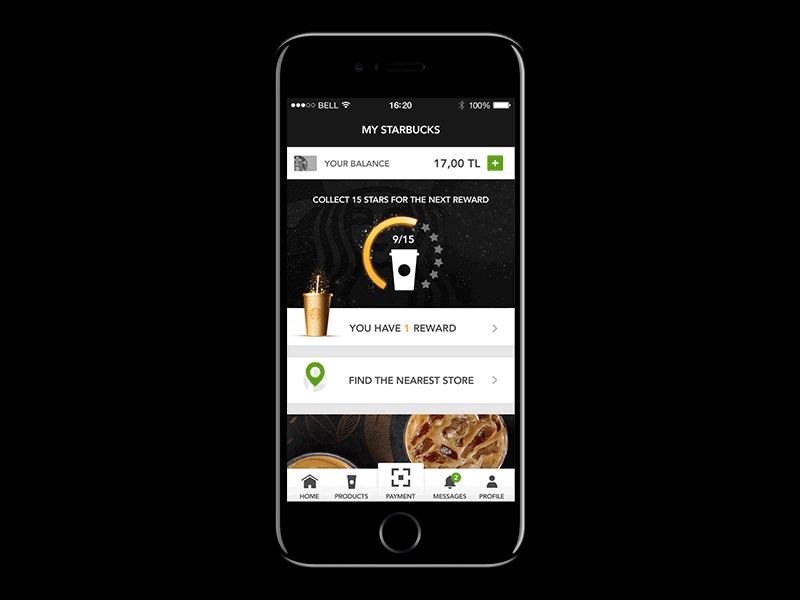
So basically i replaced hamburger menu with bottom navigation. Main purpose of this app is payment, thus i placed payment icon centered and also made it bigger.
I also redesigned rewards section. I think this way it is more explanatory and eye catching.
Also added some feeds to engage with customers. News, products, suggestions etc...
What do you guys think?