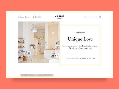
Creme Guides Concept
Last week I spent some days working on a concept of a redesign for Creme guides' website.
Upon request of the client, I focused on keeping the website very clean and minimal, while adding some user delight in the UX and some small interaction where I wanted to push the design a bit further.
I find it very inspiring working with so many constraints (two color palette, two very standard fonts, and also the fact that ALL ASSETS are square and I had to stick to make it work with only square images.
In the coming days I will show a few shots from this project.
I hope you like it!
Typography:
Gotham
Baskerville
More by HY.AM STUDIOS View profile
Services by Dario Ferrando
Like
