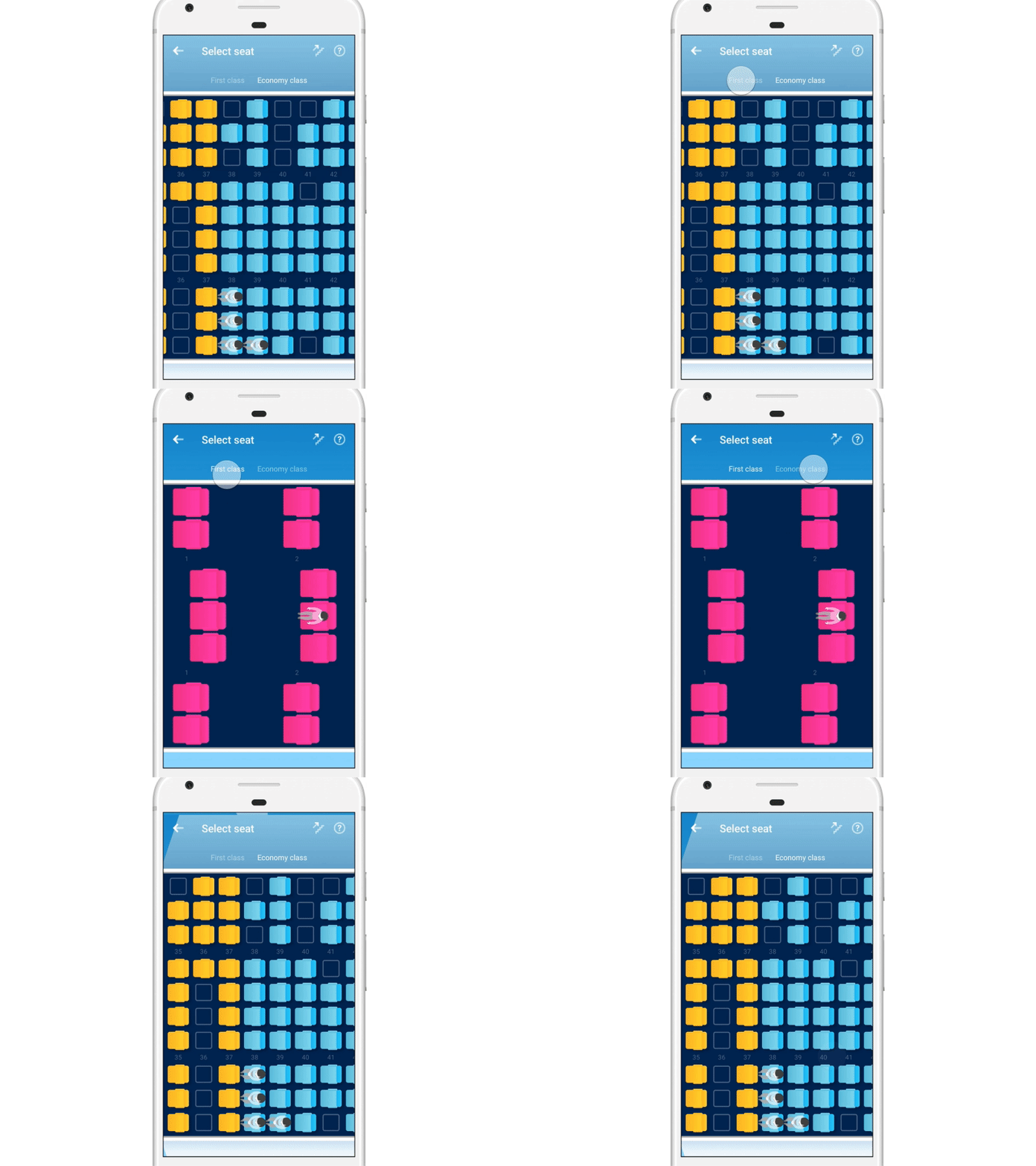
Exploring ways to demonstrate seat selection (tabs)
One of the challenges for designing app for airline is to simplify the large amount of information presentation and selection from web to mobile.
This is our exploration of how seatmap can be visual friendly represented on mobile platforms, with a playful feeling while indicating the seat map clearly.
Read our design case here (in Dutch):
https://www.mirabeau.nl/nl-nl/cases/redesign-wereldwijde-app-china-southern-airlines
English/Chinese version coming soon.
More by LexiLin View profile
Like
