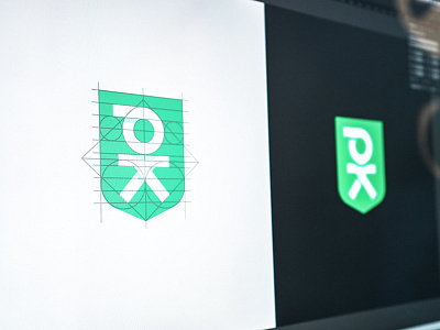
Unused PK Logo Concept
Here is a peek at an unused logo concept from a company rebrand we are working on. I love the way the geometry worked out on this one. In the end the client decided not to stray too far from the design of the existing logo.
This rejected little guy will always live on in our hearts, and now on our dribbble page :)
Made with Underbelly
More by Underbelly View profile
Like

