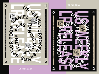
Posters for LP Release Show
Going for that so-ugly-you-can't-look-away shit. My favorite part is the thick vertical bars that compel you to read the sideways text. There's really no wrong orientation.
More by Ryan David Curtis View profile
Like


