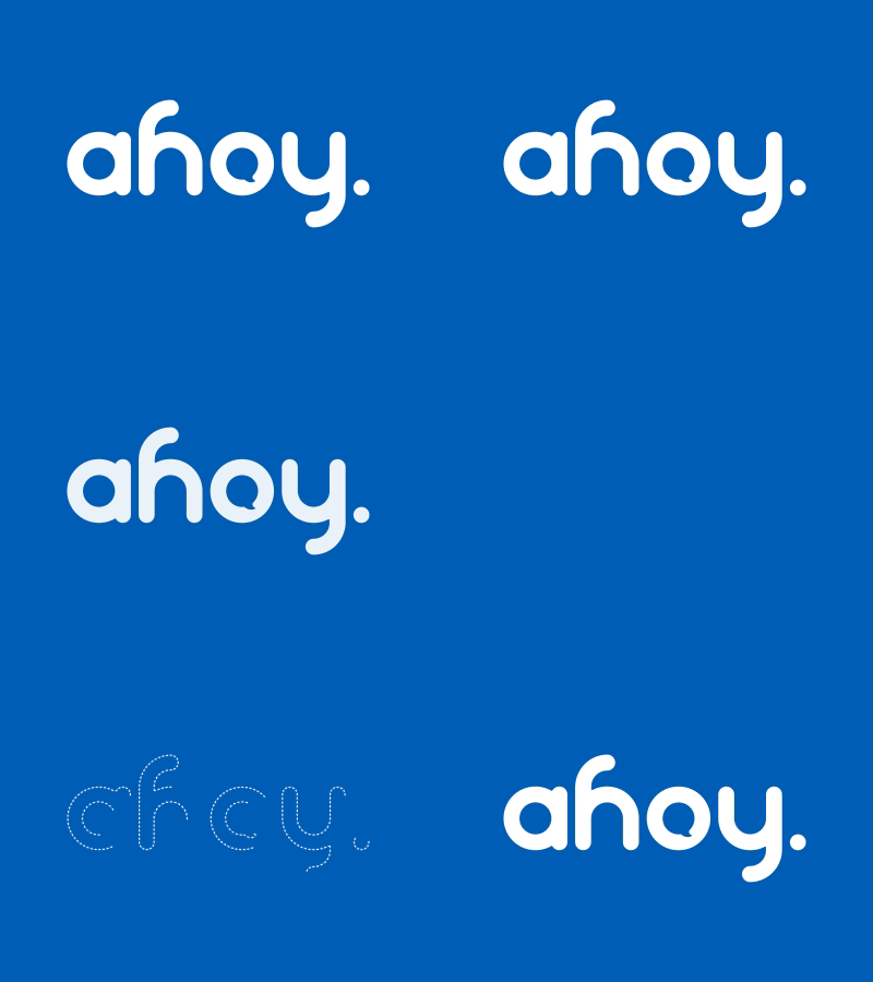
ahoy. // IT company logo
This is a logo re-design for a local IT and communication technology company. They wanted me to create a younger and fresher logotype while maintaining their original logo character. I managed to incorporate their speech bubble (their old logo featured a plain Verdana "ahoy!" on a boxy speech bubble) and established a calmer statement character by omitting the exclamation point. Also this logo is based on golden ratio circles. Hope you find it pleasing as did the client 👍. ⠀⠀⠀⠀⠀⠀⠀⠀⠀⠀⠀⠀⠀⠀⠀⠀⠀⠀~ PFOW
More by Benjamin Viethen View profile
Like
