Logo Alphabet 13-26
13/26
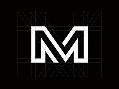
M is voor Merger. The letter M has so many shapes to work with! I had a hard time deciding what the best shape was to use in my final design)
Check out the making of video:
https://www.instagram.com/p/BSL3OezALOe/?taken-by=jhdbjoram
Follow my project for more letter logo marks!
More by Joram Hibbel View profile
Like
