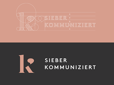
sieber kommuniziert // pr company logo
I had much fun developing the visual identity for this pr company, based in Munich.
While sketching, I felt very much inspired by the 20s – the era of the Avantgarde and the New Sobriety. And also the beginnings of public relations in Germany. So I went for timeless typography combined with a distinctive logo mark that can be used in various ways.
I'll add more shots concerning the design process and the logo usage soon. Hope you 💖 it.
⠀⠀⠀⠀⠀⠀⠀⠀⠀⠀⠀⠀⠀⠀⠀⠀⠀⠀~ PFOW
More by Benjamin Viethen View profile
Like
