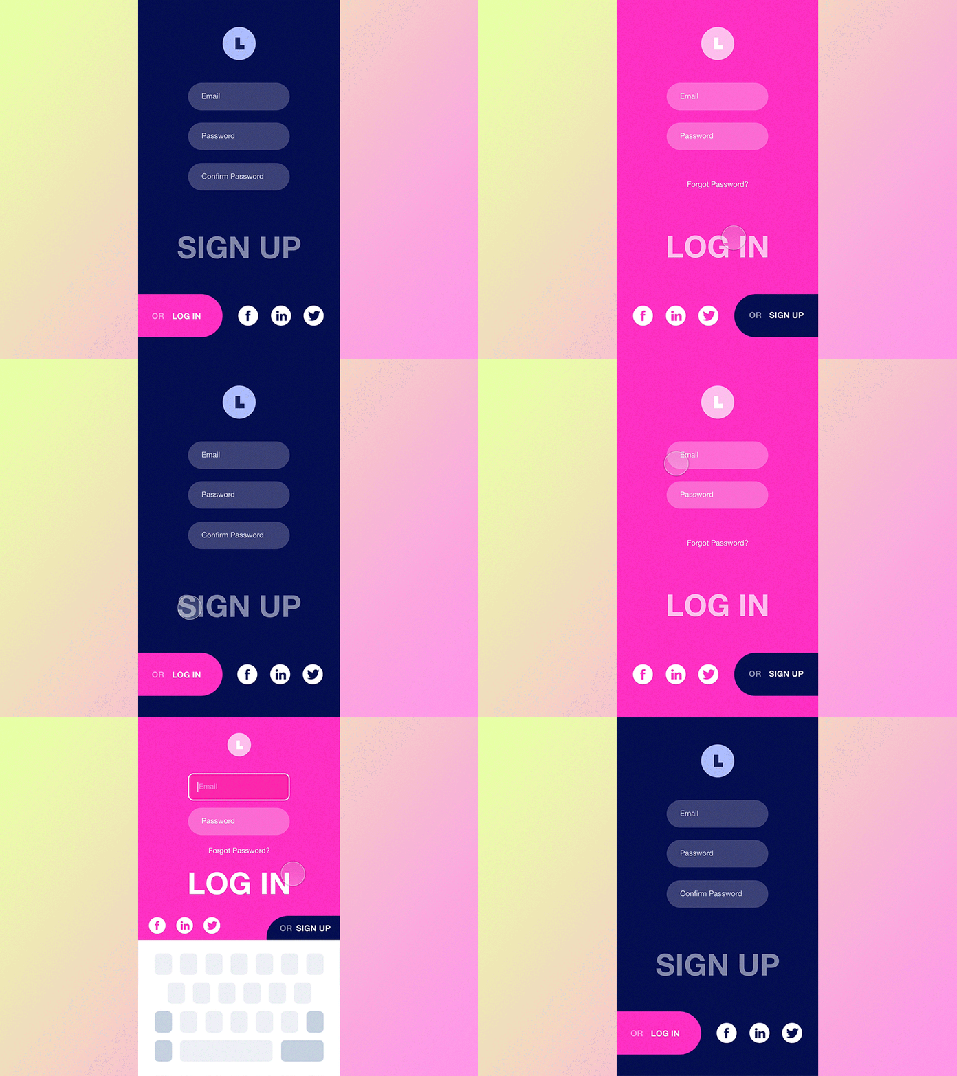
#7.3 Log In / Sign Up
Hello dear dribbblers,
We all know how important it is to make a good first impression. It's even more so when we are talking about a mobile app, as it's only a few first moments that counts for a user to decide whether they are going or not to use your app in the future.
And it's my third shot at login screen at the library. This is the only one from numerous possible options that might be applied. But this pattern, just like any other shape animation, felt challenging to be developed with Principle so here we are.
---
This shot is a part of so called interaction library that has a few main purposes: - Quick access to the example of a generic interaction you can quickly share with your client to get a reference point on the table; - It’s easy to select and implement a behavior type that would be suitable for a particular project you work on, as i’ll try for them to serve a typical UX need; - I will as well try to cover the most interesting and non-standard approaches to explore relatively fresh behaviors so we all stay mainstreamed and aware; - I do love create nice and smooth interactions and so now i have a chance of doing that independently of the project i currently work on most of my time :)
P.s. Thanks for hitting "L" if you like it, this will tell me to keep designing more of it!
