(Unofficial) WeTransfer redesign
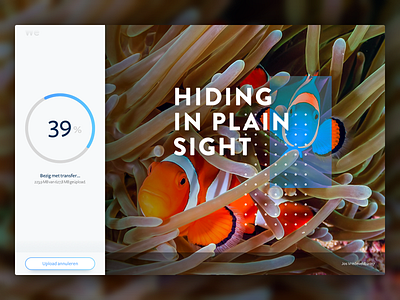
One of the features I like most about WeTransfer, is also a feature that could be executed better. A large portion fo the screen is being used as an area to showcase art or photography, yet the current design of WeTransfer has a floating box over that beautiful image.
My (unofficial) redesign uses the left 25% of the screen to house all the user-interaction. Leaving the other 75% free to showcase those great pieces of art.
More by Jos View profile
Like


