Annotations UI
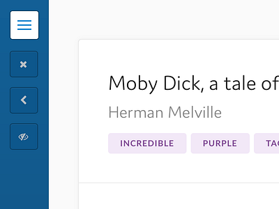
Close to finishing a long project building an annotations application for english language students. Making some essential changes to the UI.
I would very much value some feedback at this stage. All feedback welcome.
In particular, I’m struggling with the right hand filter styles and general contrast of the page. There is alot happening on one screen. Source document on the left, annotations on the right.
More by Gavin Hall View profile
Like

