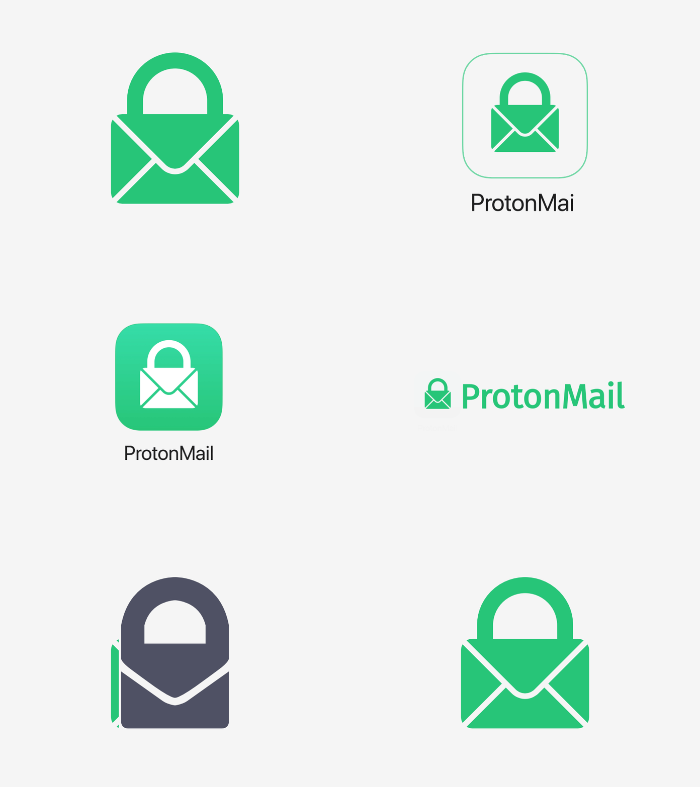
Unsolicited ProtonMail Mark Restyle
A couple of days ago I signed up for a ProtonMail account and since then every time I look at their logo I feel like the mark could be a little more explicit (especially when used in isolation as in the iOS app icon).
Maybe it's just me, but in their current mark I keep seeing a finger or a bag rather than a mail envelope with a padlock 😊.
I had some fun restyling the mark to look a little clearer (at least to me).
More by Marco Corti View profile
Like


