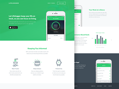
Lifelogger Landing Page
This is the landing page from a design challenge that I recently participated in. The mission was to create a few app screens and a landing page for an app that would monitor self improvement. Here was my write up with the submission:
"Self improvement isnʼt a “piece of cake”, but tracking it should be. Using bright colour, playful icons, and a light user interface, I made Lifelogger to be a seriously fun self improvement tool. The goal was to keep things simple by using features that would work coherently with other apps to provide enhanced data. For the landing page, the focus was equally about selling the app itself, as it was selling what life would look like using the app. With only seconds of the userʼs attention, I felt it was important to give a clear idea of what the app would feel like throughout the design of the landing page."

