Continued Logo Exploration
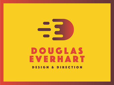
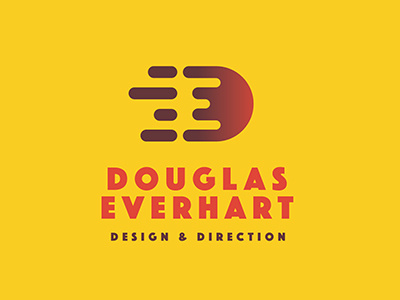
There was something about my previous version that felt like it was missing something. So I ended up making sure the smallest radius size was equal throughout besides the two in the middle of the "E". I also wanted to simplify it more so i've maintained the strokes and reduced them down to three to almost reflect that negative space within the D.
I think i've achieved more simplicity and am really loving how this refined version looks. Let me know your thoughts!
More by Douglas Everhart View profile
Like

