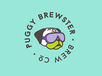
Puggy Brewster
This is a personal project I've been working on for several months. I was on a roll, working on applying it to materials, but after a while I started feeling really unsure about it. Now I've completely stopped to step back and see if I can make improvements.
ANY AND ALL FEEDBACK IS WELCOME!
Since the craft beer industry started booming, I've been dying to work on a branding project - namely label designs - but since I don't have the opportunity in my day-to-day work, I figured I'd just create my own for a solid portfolio piece.
Anyway, I was inspired by my boyfriend's love of pugs, puns, and 80s design (since we were both born in that era). Silly? Perhaps, but that's what makes it fun. I've worked out several varying concepts with different illustration styles, fonts, and colors - this is where I ended up, but I still don't feel like it's quite there. Any suggestions for revisions are appreciated!
