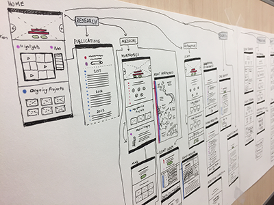
Web App Low Fidelity Mockup
This is a low fidelity mockup of a web application I'm designing and building for the University of Michigan. I collected all of the information they already had and organized it into four categories: Why, How, What, and the Call(s) To Action, which I marked on the mockup with red, pink, blue, and green respectively.
More by Lauren League View profile
Like
