PDCo Typography Exploration 2
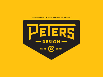


Hello friends. This is a rebound of my shot from yesterday. I took your critiques to heart and revised this mark. The top of the P now balances the T's top bar. I mirrored the slant of the S on the lower bowl of the P. I also squared off the bowls. Please check out the attachments to see a version with just the type.
I'm thinking this mark needs a strong icon/mark up top. Knowing me, it'll probably something with a pencil or eagle. We'll see.
Thanks for your help on this. I like the way it's turning out.