Mint.com Budgets - Expert Review
Overall, Mint.com's budget tool comes across as dated (from a UX perspective).
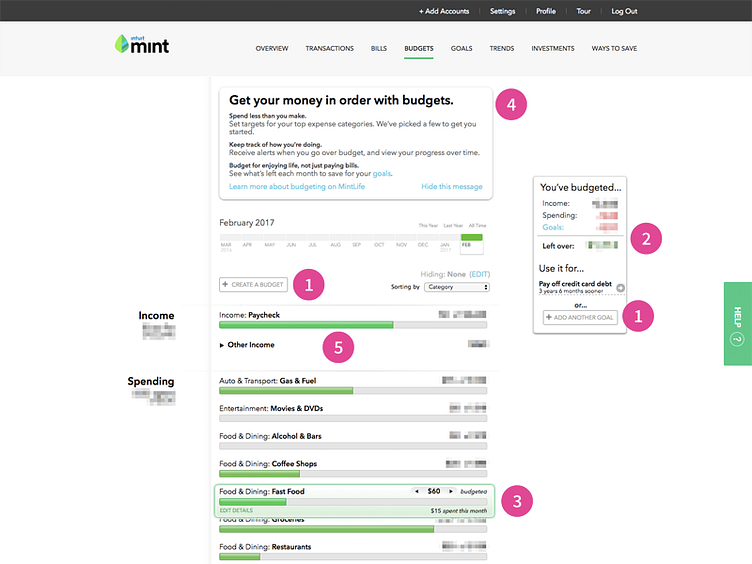
It had un-noticeable calls-to-action or CTAs ("Create a budget" and "Add a goal" buttons). SEE CALLOUT #1.
The visual cues for those CTAs need to be a lot stronger. Needless to say, the same applies to the minor CTAs; in a usability study, I'm expecting test users to have some difficulty editing a category budget (or at least, getting it started). SEE CALLOUT #3.
For data-driven products, key numbers (just like CTAs) should be hierarchically more prominent. SEE CALLOUT #2. I notice an attempt to create hierarchy with slightly larger font size. Unfortunately, those fonts need to be much larger in order to be noticed; I would hypothesize that the progress bars draws most of the attention in an eye-tracker test. SEE CALLOUT #5.
The only "true" copy lacked any meaningful information. The advise within the copy is borderline (if not) cliche and probably lacks impact on behavioral change--the intent of a budget. SEE CALLOUT #4.
Despite all this, I do think that the use of data visualization (progress bars) were effective in telling a story. I would recommend more of it to make massive amounts of data more consumable and less overwhelming as a UX.
