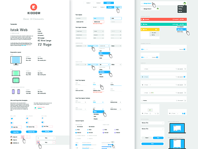
Kiddom Product UI Guide
Here's a small bit of a large product UI guide I designed recently for Kiddom. A digital product needs to feel like a well-designed physical product. The interface needs to have a style and feel, and it should be consistent with the personality expressed through the brand. This was designed to be used in an extremely flexible way, from web to mobile, and takes advantage of a wide color palette without feeling too whimsical. Really proud of this set!
More by Kiddom View profile
Like


