Logo Positive - New Identity
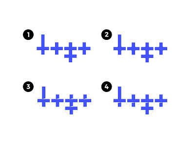
Exploring some new ideas for my personal identity for Logo Positive. I'd love to hear your thoughts and opinions.
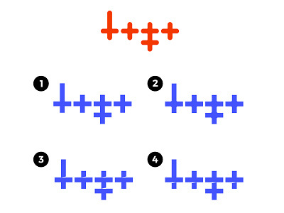
After a bit of reflection, I think the current one is too rounded which might reflect a childish/amateurish feel. I want to aim for something a bit more bold and sharp, that shows I mean business.
On option 3 and 4, I like the angled cutouts, and they could stand to represent growth as they slant upwards, but they won't be all that visible at small scale. Although, the overall mark will still be recognisable so I'm not sure this is a huge issue.
I've also opted for a new colour, a soft blue with a hint of warmth, which will represent professionalism, reliability, communication, honesty and authority.
More by Logo Positive View profile
Like


