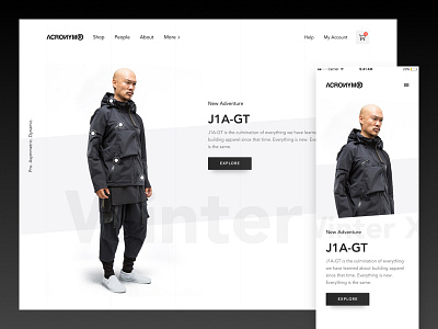
Acronym Redesign Exploration
Acronym is an apparel company with a unique aesthetic. High-quality gear and technology-subtle pockets for cell phones or spaces for headphones, among other features—almost like clothing for science fiction novels.
My primary goal here was to create a clean and minimal design that was suited for a modern consumer product. Also, I tried to improve the connection between the brand and users by adding differentiating features that set the website apart from other eCommerce sites on the market.
It's just a personal exercise. All rights reserved to Acronym.
###
If you’re in need of a UI/UX designer, drop me a message! hello@89nod.es
Follow me on Twitter
Follow me on Instagram
Thank you! ✌️
More by ++hellohello View profile
Like


