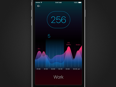
Gofar App Study
UI study for the Sydney-based startup “Gofar”, 2015. There were several studies like this, with the goal to determine different ways for data representation and capturing feedback from staff and users.
Every UI decision was based on strategic thinking. Because this view was going to be used inside a car, I wanted to keep the UI dark, like a typical car UI, and use colour to highlight areas of interest. The feeling I was looking for was luminous, magic, data coming out of the dark, revealing itself and to dynamically display only what the user needs at the moment. You could swipe left and right to travel back and forth in time.
Produced in Sketch and Pixelmator, without any Adobe software.
If you’d like to get in touch: Send me an email
More at Core

