Waizu
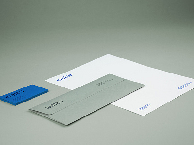
Waizu’s new corporate Visual Identity was given a progressive look, using a customized typeface wordmark, that has a strong technology feel. Its corporate stationery package is bold yet subtle, at the same time. The business card design uses a distinct, vivid blue background colour. Design elements are foil-stamped, with a tone-over-tone metallic blue, that creates a strong impact and a mysterious visual effect. The custom envelope is created from a different fine paper stock, that has a complementary tint.
More by Sylvain Toulouse View profile
Like
