Color in UI: Design Tips.

Hello dribbblers! It's Friday again so it's time for a new set of reading we have collected for those who are interested in design.
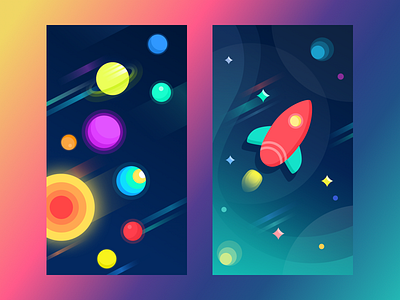
No secret, in design color is power. It can change the mood of the image in a blink of an eye. It can encourage, warn, appeal, frighten, highlight, persuade and so on and so forth. It can support the words or vice versa – steal their power. It can share an emotion without anything said. It can become a great weapon in the hand of a master. Today's shot presents you the set of articles from Tubik Blog devoted to the issues of choosing and using colors in UI design.
Color in UI Design. Look on the Bright Side.
Color Theory: Brief Guide For Designers.
Color in Design: Influence on Users’ Actions.
Dark Side of UI. Benefits of Dark Background.
Light and Darkness in UI Design. Matter of Choice.
Join in, welcome to read and let us know if you want to see some particular topics explored in Tubik Blog. Nice upcoming weekend to all the dribbblers!