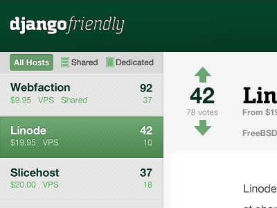
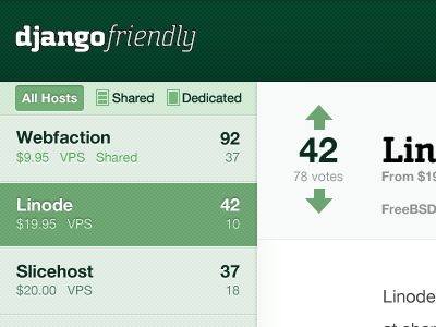
Djangofriendly redesign
When seen in full, all the green in the previous screenshot was a little too much. For this rebound, I've taken all the green out of the sidebar and content backgrounds. Now, green text and graphics stand out more, better communicating that they can be clicked on.
More by Ryan Berg View profile
Like

