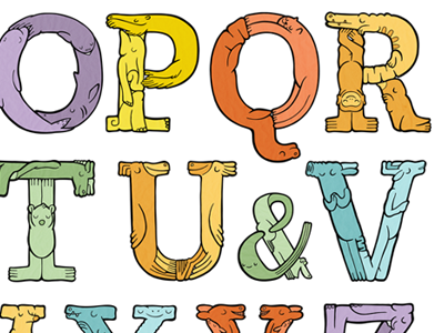
Placement of Ampersand
So, I am laying out the creature alphabet print and have run into a problem with that Q's descender. It's interrupting the flow of the line below it. One solution I considered is inserting an ampersand between the U & V. I originally wanted to place the ampersand between the Y & Z but this alternative placement does seem to solve the visual problem created by the Q. Problem is, it may not make a lot of sense to put that ampersand there. I'd prefer not to make the letters much smaller than they already are, as you begin to lose each character's detail in the print (I'll be printing this at 13" by 19"). Any other suggestions? How do you feel about the ampersand there?
These letters are based on an existing font, Adelle Basic by TypeTogether. I didn't randomly throw one descender into an uppercase character set just for kicks :)
