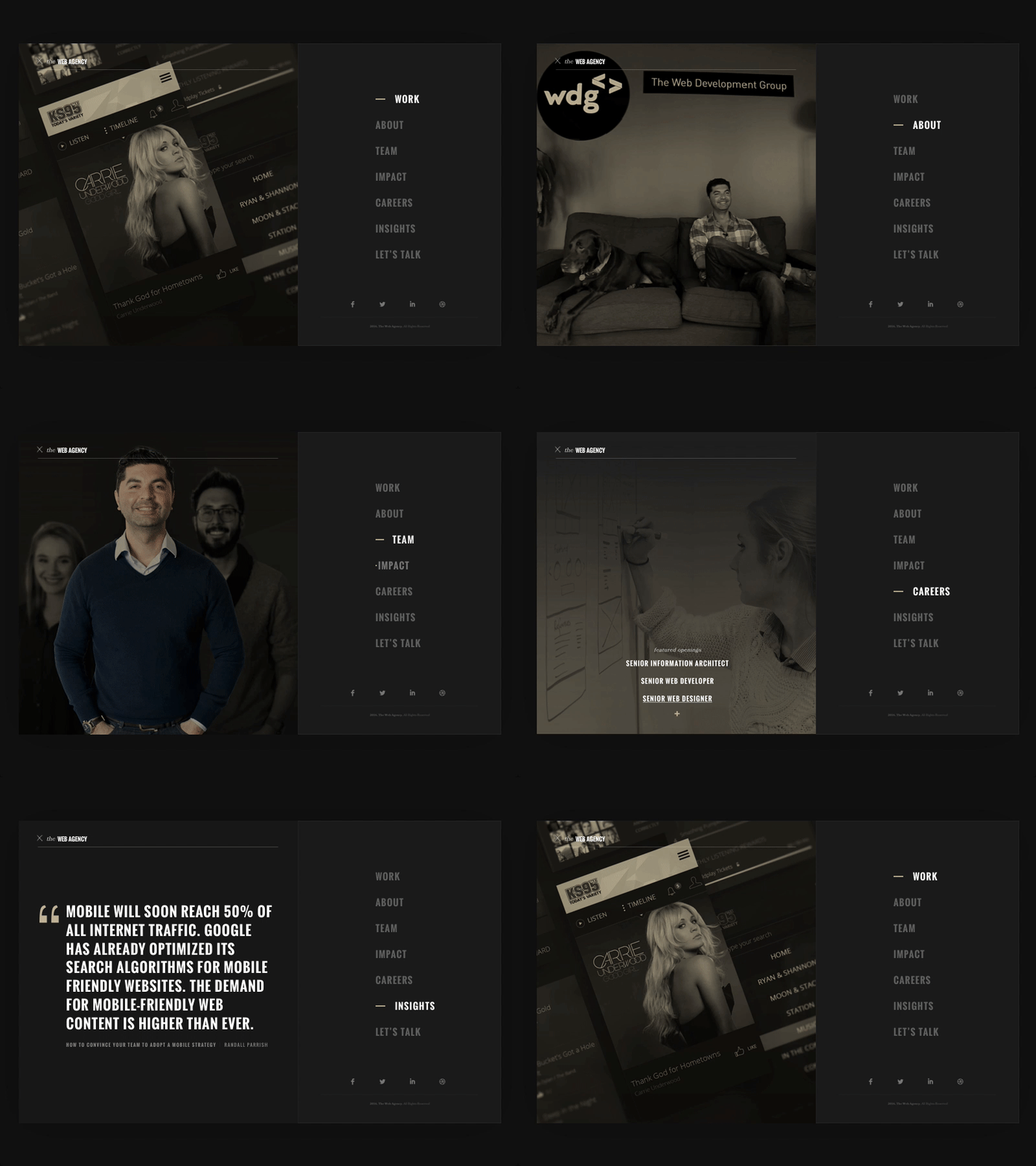
Web Agency Menu
This was my proposal for a navigation taking advantage of a split-screen canvas in an old exploration for the @WDG site. I wanted to see what kind of intrigue or preview of a section I could provide on hover, so for example: on work you see a featured project, on careers you see curated job openings, on Insights you see a pull-quote from a recent article, etc.
Ultimately this entire direction went another way - but I'm still fond of dark, sophisticated interfaces like this.
More by 🔊 Randall Parrish 🔊 View profile
Like


