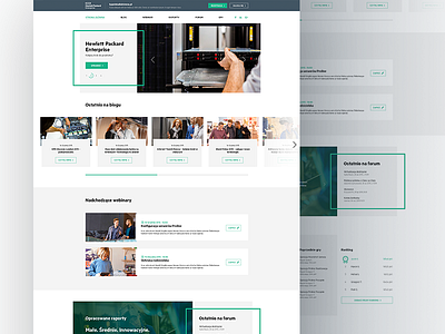
Strefa HPE - Home page
As a company looking to serve customers with information on the most cutting edge technology in IT, it was vital that the Hewlett Packard Enterprise website looked every bit as slick and forward-thinking as the content.
Frogriot created a user-friendly knowledge base, designed to act as a hub for expert advice on IT solutions and emerging technologies for business. To accommodate the wealth of HP’s knowledge, the website is divided into five key sections; blog, webinars, reports, forum, and games.
When designing this website, we ensured that UX was front of mind and we think that shows in how easy it is to use; not only does the website look great but it is fully responsive and works fluidly across all devices.
Thanks for reading and take a look at the attachment! Peace:)
________

