Night in Berlin: Event Screen Version.
Hi guys!
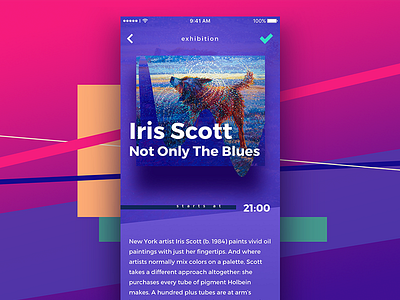
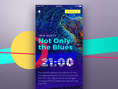
Today brings the final shot for the series called Night in Berlin App. To remind briefly, it's the simple app for active sociable people to see the list of all the events taking place in Berlin. Previous shots showed the event list organized along the cards, giving the preview of information and theme image. Being interested, the user can tap on the card and see more details – here is another option of the full view for the particular event. Again, the screen features the exhibition in the art gallery, but the visual hierarchy and performance differ from the earlier variant: the background shows the view of the full artwork, the name of the artist becomes the key element of the composition given in easily readable white lettering providing good contrast in the bright interface. So, users can scan the core data in split seconds. Bright mood to all the dribbblers!
To share more ideas we get working on design, we regularly update Tubik Blog with new articles. One of the latest case studies presents another project from Tubik UI Fridays called Big City Guide. Join in!

