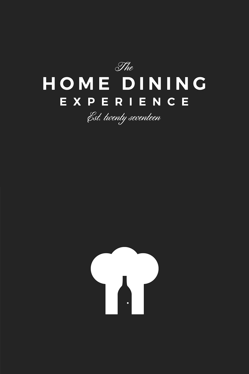
Home Dining Progression
More progression on the concept for Home Dining.
Specifically looking at typography combinations and layout. Also made a slight refinement to the logomark, removing the door/label and just simply adding a bigger door handle.
Let me know your thoughts!
More by Adam Sidaway View profile
Like
