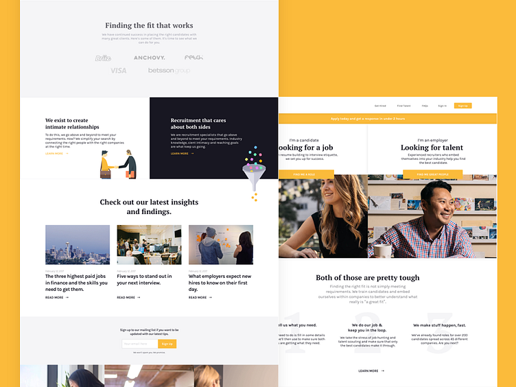
Homepage for a Recruitment Agency 👔 💼
The photography is not being used as it doesn't belong to me, used Hired.com's assets for the sake of this shot
I didn't get to see this project through but it was still pretty interesting to work on. A recruitment agency typically is viewed as deceptive for both sides of the fence, both the employer and the employee. Talking to a few people we found out that their experiences with agencies was what we anticipated which was that most were in the space to make a placement at any cost, something which does not align with the values of either the candidate or the hiring company.
What this has led to is multiple scenarios that we had to take in mind. For example, high value candidates were being inundated with requests from undesirable employers whereas the employer might get candidates that are either sub-par or non-serious about working at the company. Scenarios like these have fundamentally changed the candidate-agency-employer dynamic. The intermediary is no longer seen as relevant unless there's cases like high volume recruitment or low-level positions that need to be filled.
That's why the discussions we had with the client weren't on how a website could help their business, we knew that was far from actually solving the problem. It revolved more around what the business model should be and how a website can enable that. After some research and lot of adhoc meetings, we figured that whatever we delivered, had to communicate that this agency was dedicated to creating more intimate relationships with both candidates and clients
