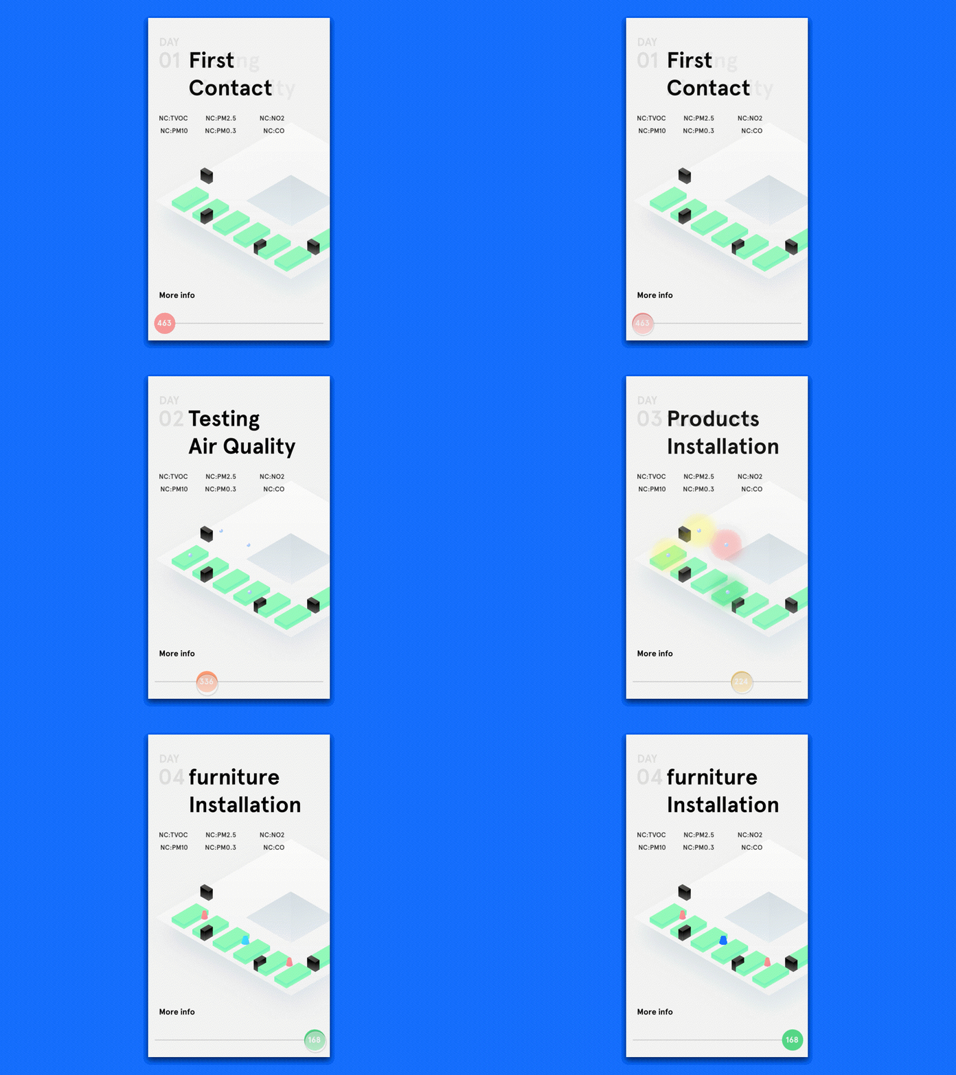
Early prototype for air clean air solution case study
Rethink the content structure and micro interaction.
The original version is a long page, when user scroll up, he will see the result is getting better. but the data and diagrams for each step are isolated somehow, the connection between each step is lost, so I made another version, tried to create connections between different information like data and diagrams, also using a simple interaction gesture to help create a better user experiences.
More by Xue Gu View profile
Like
