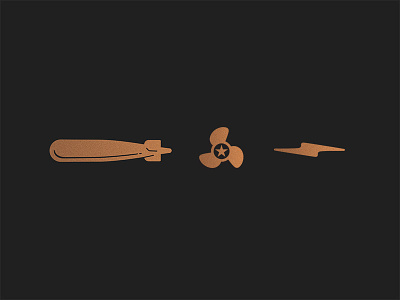
Which one looks more like a torpedo?

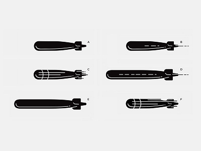

Working on a restaurant identity. Torpedo is because the restaurant is located in a historic building where they made Torpedoes. The client loves the brand icon but one partner voiced a concern that the torpedo icon may look too much like a bomb and could have a negative impact on the brand. So I did a few tweaks on the icon to make it look more like a torpedo. The original icon is A. I can't share the full concept yet but what you guys think? Which of these icons do you think looks more like a torpedo?
Feedbacks are greatly welcome!