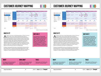
Customer Journey Mapping Method
What do you think? Pink or blue. Both have the brand colours. However, at the origin, I wanted to create pink theme illustrations. Now, I have to use photographs mostly. And I feel that the pink is too strong since I want the double-diamond graphic to stand out at the upper-right corner as well as the photos need to match the overall look and feel. I do not have time to retouch photos, and sometimes, I feel that it is clashing somewhere. It is a long book. I would appreciate your opinion. Thanks in advance.
More by Rosanne Simon View profile
Like
