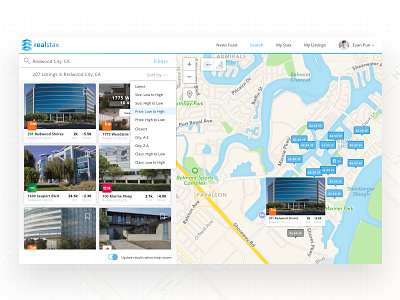
Realstax Webapp Search & Sort
This is a shot of the search feature for our Realstax webapp.
When thinking about how to present this feature, I thought hard about ways to simplify both it's functionality and presentation. One thing our team went back and forth on was the importance of displaying search results on a grid vs a map. In our original designs we had a 3x3 grid of listings on the left hand side and focused more on searching for listing through the grid with a limited map view.
After several user feedback sessions we reduced the column down to 2x3 and expanded the map view because our users wanted to have more functionality with the map. This also allowed users to focus on only 6 options as opposed to 9 options, which helped with decision fatigue.
More by Evan Pun View profile
Like

