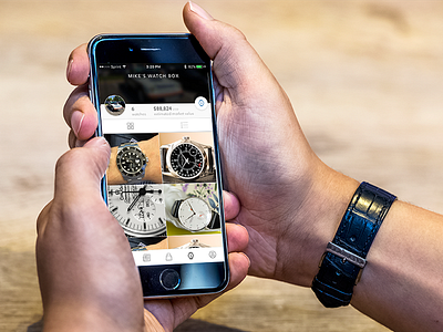
OnTime - Watch Box
Dead concept in revisiting the watch box section of the app to focus more on individual product and then allowing for a toggle to a detailed/market view. Splitting into a market tab and more of a show/tell side.
Whole screen is going to head more the direction of being an analysis page and even a bit less visual than it is currently.
More by Mike Heitzke View profile
Like

