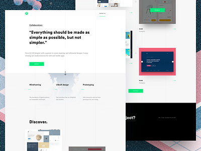
Personal Website
Hooh!
Finally I've made personal portfolio website. That was rly hard descision but I've tried to make something pretty simple and
interactive.
I've used strong typography, strict light colors and black contrast between blocks. CTA affects by it's catchy color.
Used fonts:
Circular: gorgeous geometric typeface with clean shapes
Charter: hilarious and clean serif font
Background illustration by Yulhanri Alfath.
Don't forget to press "L" if you like it and check out attachments.
Cheers!
More by Serhiy Ozhibko View profile
Like


