Converge.org
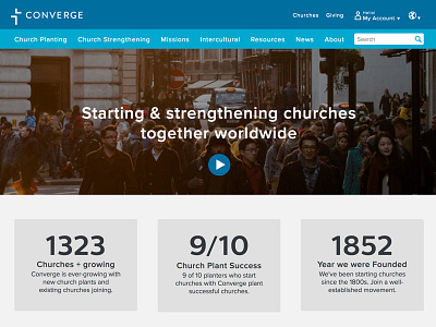
In 2015 I redesigned the Converge.org website. It had been about 5 years since the site launched and it no longer reflected our organization's mission or brand. While we couldn't go responsive yet (thanks Drupal 6), I created a theme that allowed us to highlight our major ministries and conferences, while still guiding people to the specific information or action they needed.
Earlier designs included a one-part menu and more eye-catching homepage elements, but we needed to create a mold that would work for 10 district websites.
This final design isn't awesome but I like it. It's simple, easy to navigate, and conveys all it needs to. It served it's purpose. You can peruse the full site at https://converge.org
More by Ben Stankich View profile
Like
