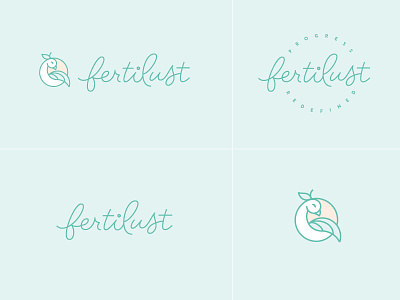
Fertilust - Secondary Logos
As with any of my brands I knew the Fertilust identity had to be extra flexible for the brand's current needs as a blog and newsletter, as well as future pursuits as they evolve into a larger wellness + food initiative. I may have gotten a bit carried away, but I love how the mark and logotype translate throughout the different logo variations. Each one is unique, yet they all feel at home in the brand.
If you'd like to hear more of the juicy rationale behind this brand, stop by and check out the post: http://melissayeager.com/blog/2017/fertilust-brand-identity-website
And don't forget to check out the full brand in the attachment!
More by Melissa Yeager View profile
Like

