Livongo Brand Identity Program
Diabetes is a growing problem for Americans, with over 9% of the population suffering from the disease. Livongo approaches diabetes management differently.
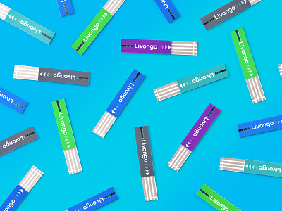
Livongo impacts positive change in the lives of its users, and we wanted the design of the brand identity to reflect that spirit and enthusiasm. The resulting icon, an uppercase “L”, combined with a forward pointing green arrow, symbolize that positivity and the potential for change within us all. The paired typography, bold and clear, enforces a feeling of confidence in the product and the support Livongo provides.
One of the challenges with diabetes is difficulty seeing clearly. This was top of mind when selecting a color palette—saturated is a necessity—so that members can navigate the product and website with ease.